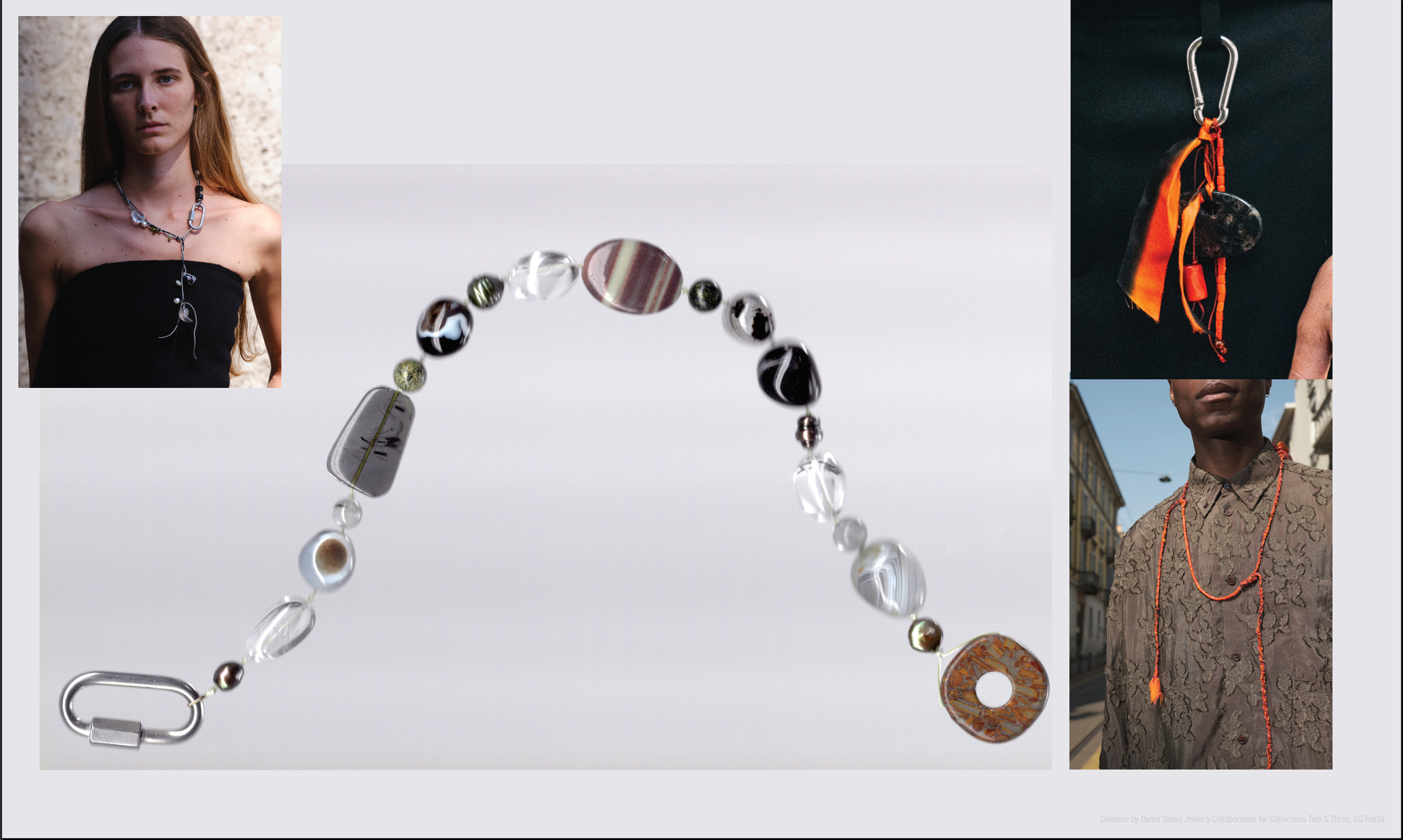
Featured

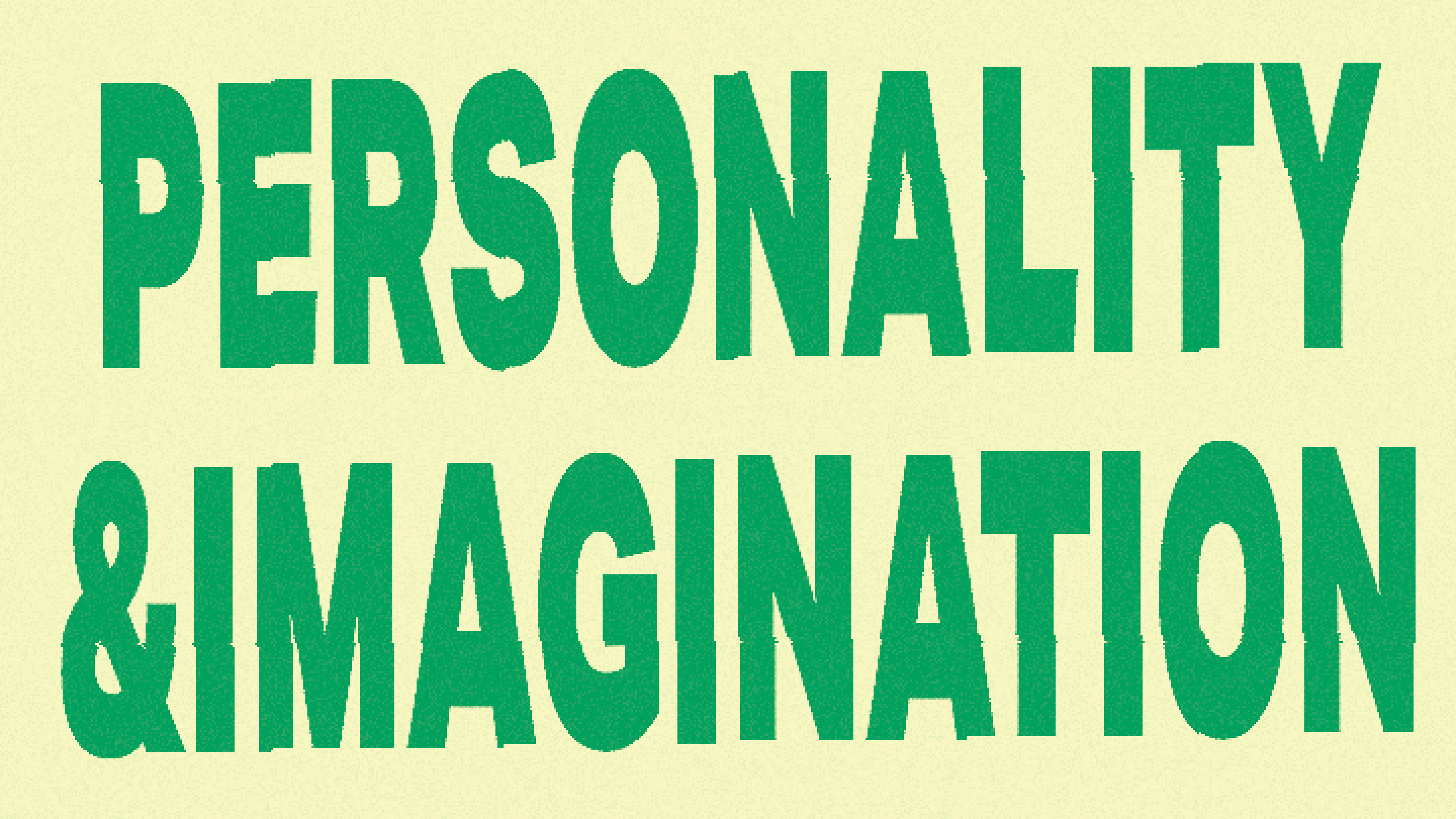
I've been teaching about technology at Pratt's communications design MFA since 2021. Recently I've gotten it into my head that design education should be based around teaching students methodologies. In particular, I am interested in methodologies that use visual processes to digest the world. Basically, I just want to transcribe and share conceptual processes — similar to how to you might instruct someone how to approach typography.
This semester I am leaning heavily into that idea. We are working through several methodologies the students will use to develop a critical relationship to technology. Some of these are:
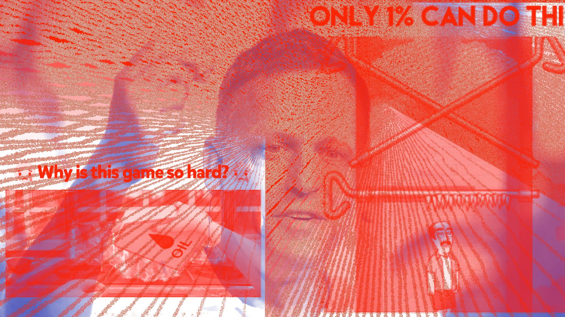
- Creating visual analogs of technological metaphors
- Identifying the image of a technology
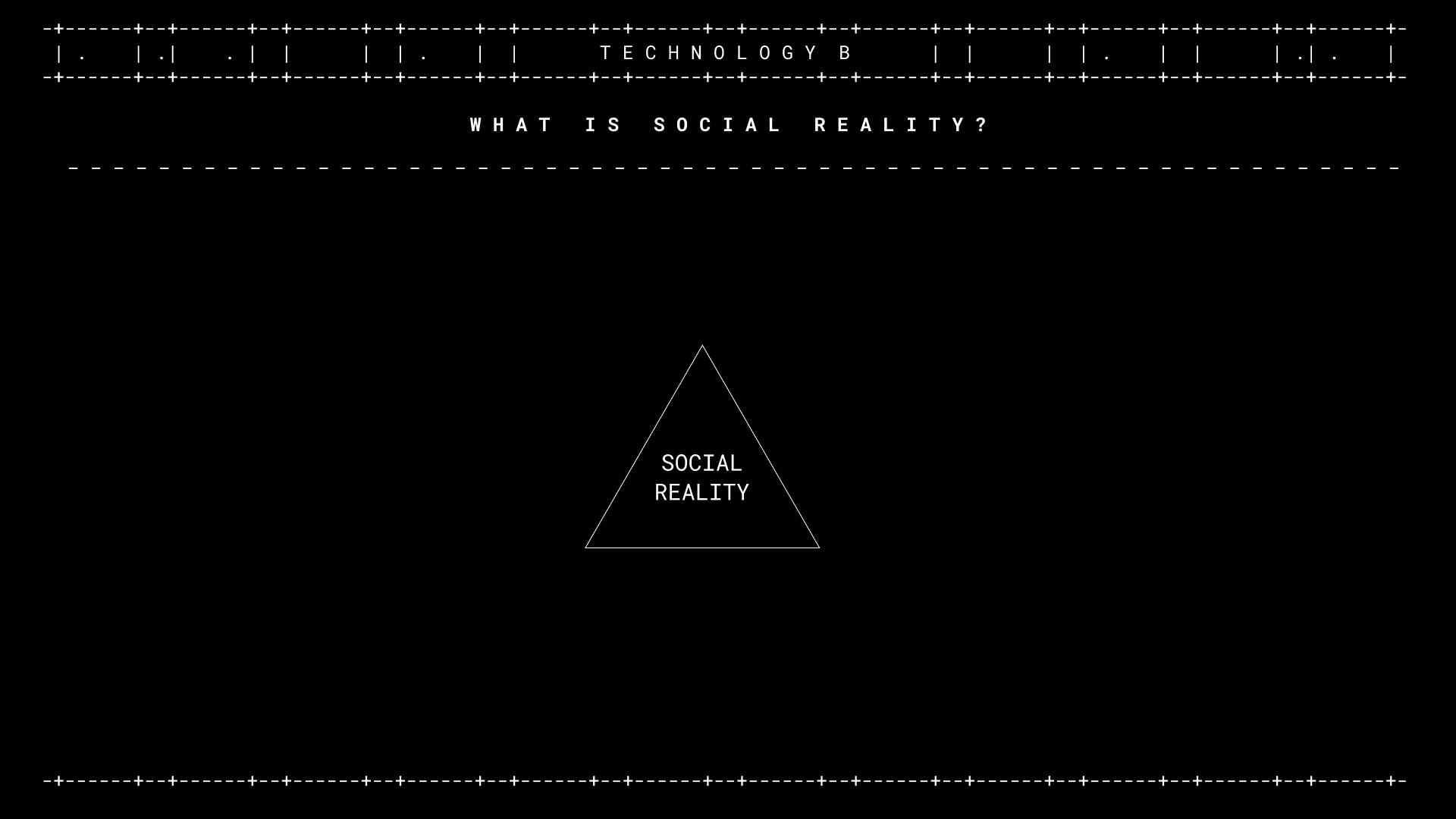
- Tracing narratives in how technology constructs social reality
- Analyzing how visual language hides or shows power dynamics
- Creating visual forms for counter-narratives using parody, appropriation, inversion, and refusal
When the course is done, I'll share the materials here.
Tagged as:

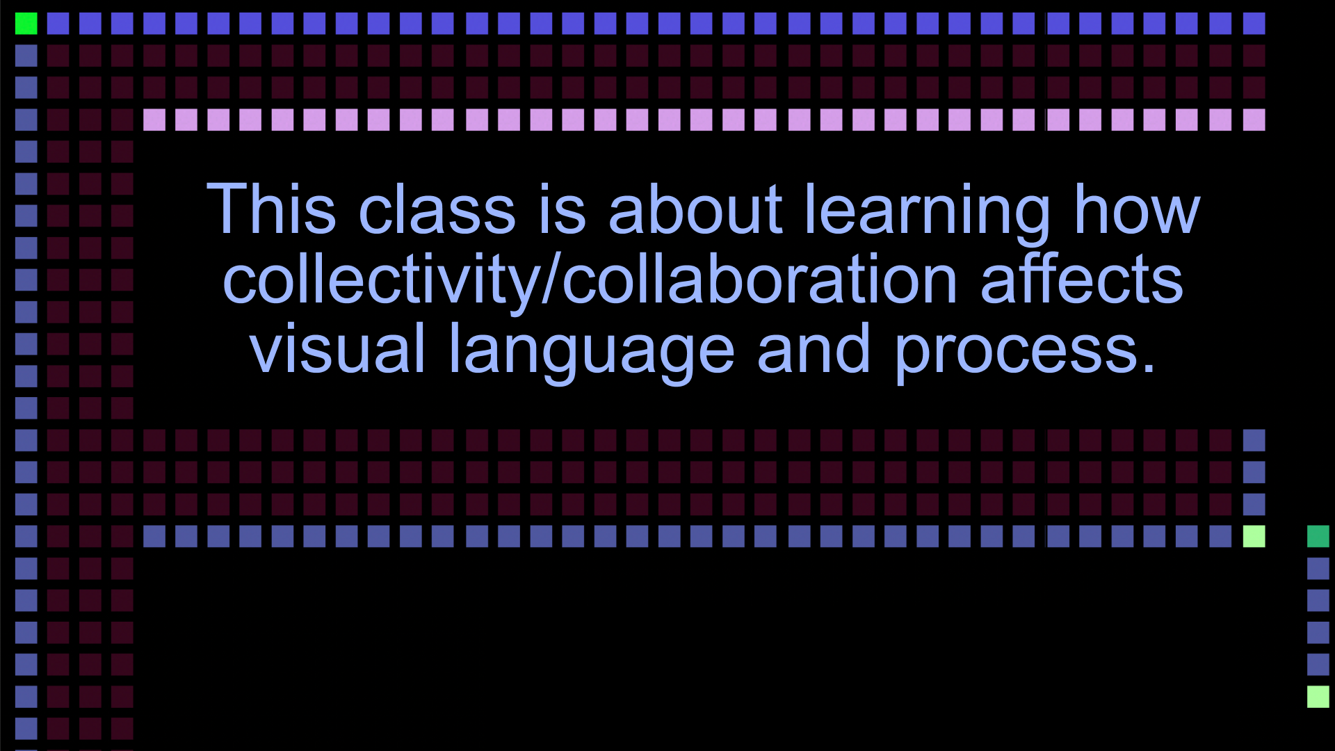
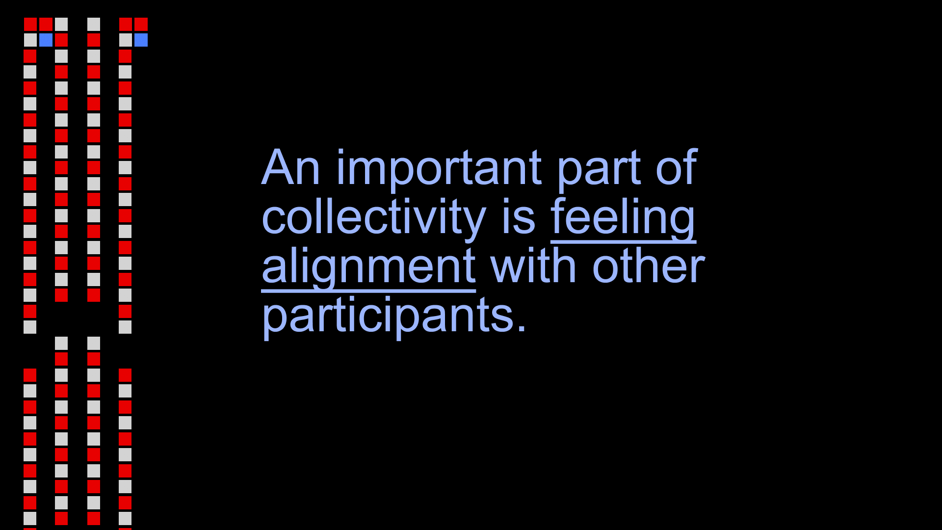
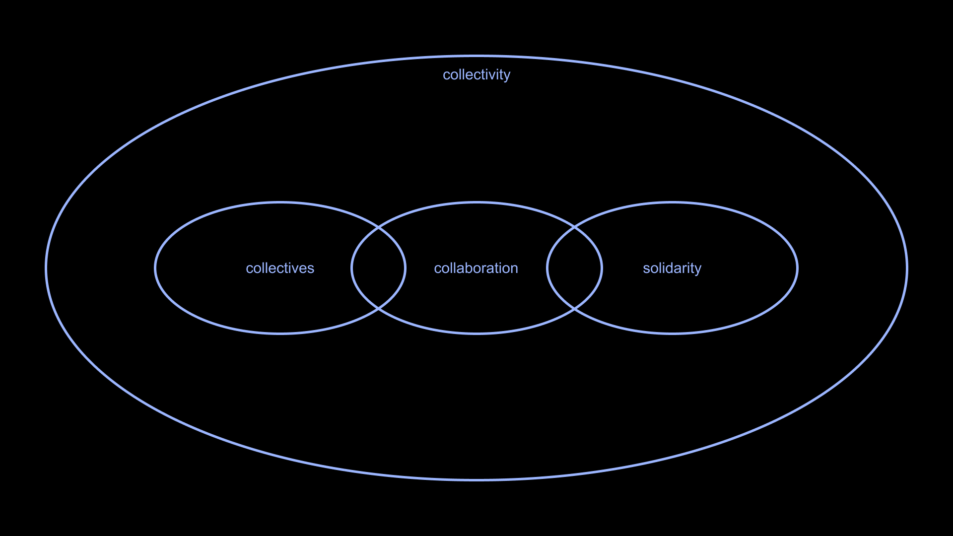


Recently I have been teaching a class about collectivity and collaboration for designers. It's been a really beautiful thing to watch students begin the semester saying “I hate group projects,” and end the term completely changed. Students are put into groups and tasked with making a project that results in a publication. Along the way, they learn concrete methodologies for organizing and sharing work, as well as political concepts about what it means to really be together.
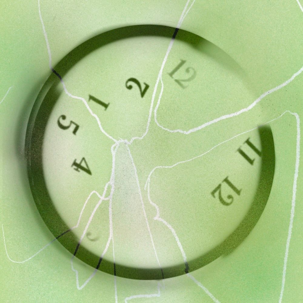
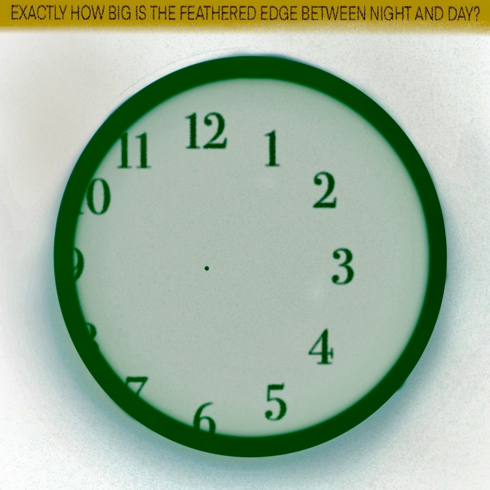
In making the course materials, I have been playing with a motif that's derived from blasting up the saturation on anti-aliasing. As a result, emphasis is placed directly on members of the edge. Where typically anti-aliasing would blend a foreground and background, here instead the difference is exaggerated and made colorful. To me, this serves as a visual representation of a critical point that comes to us from Critical Art Ensemble: solidarity through difference.
This course is taught at Pratt’s MFA in Communications Design. It is based on a model designed by Kimi Hanauer and Asad Pervaiz, and indeed it continues to develop in part due to loving collaboration of our teaching affinity group.
I love teaching this class!
Tagged as:
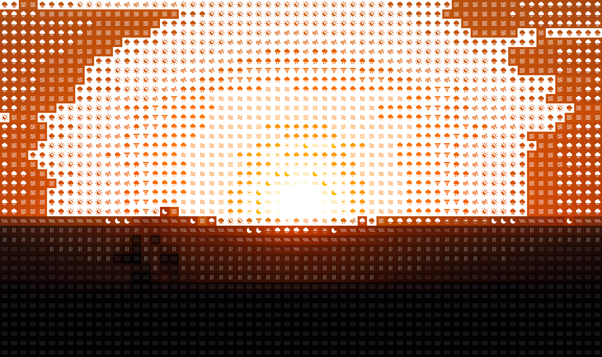

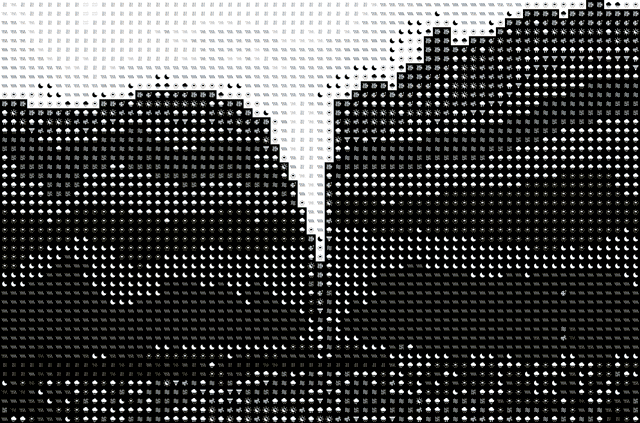
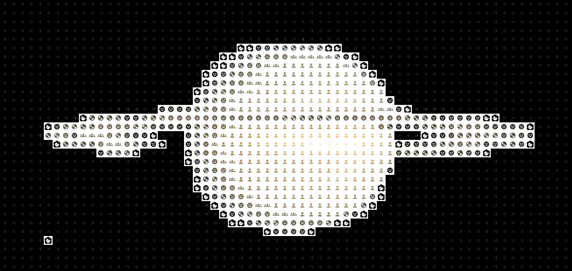

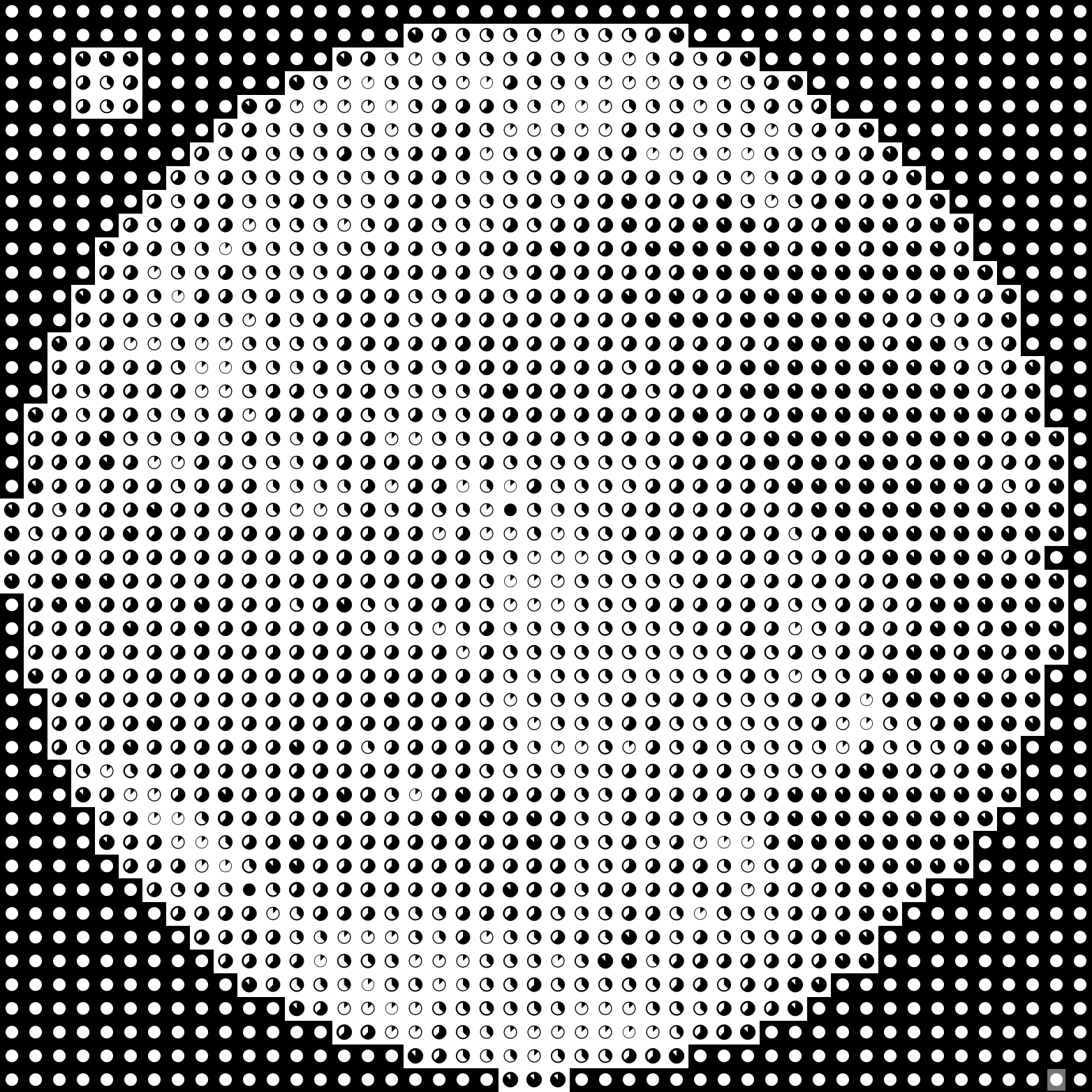
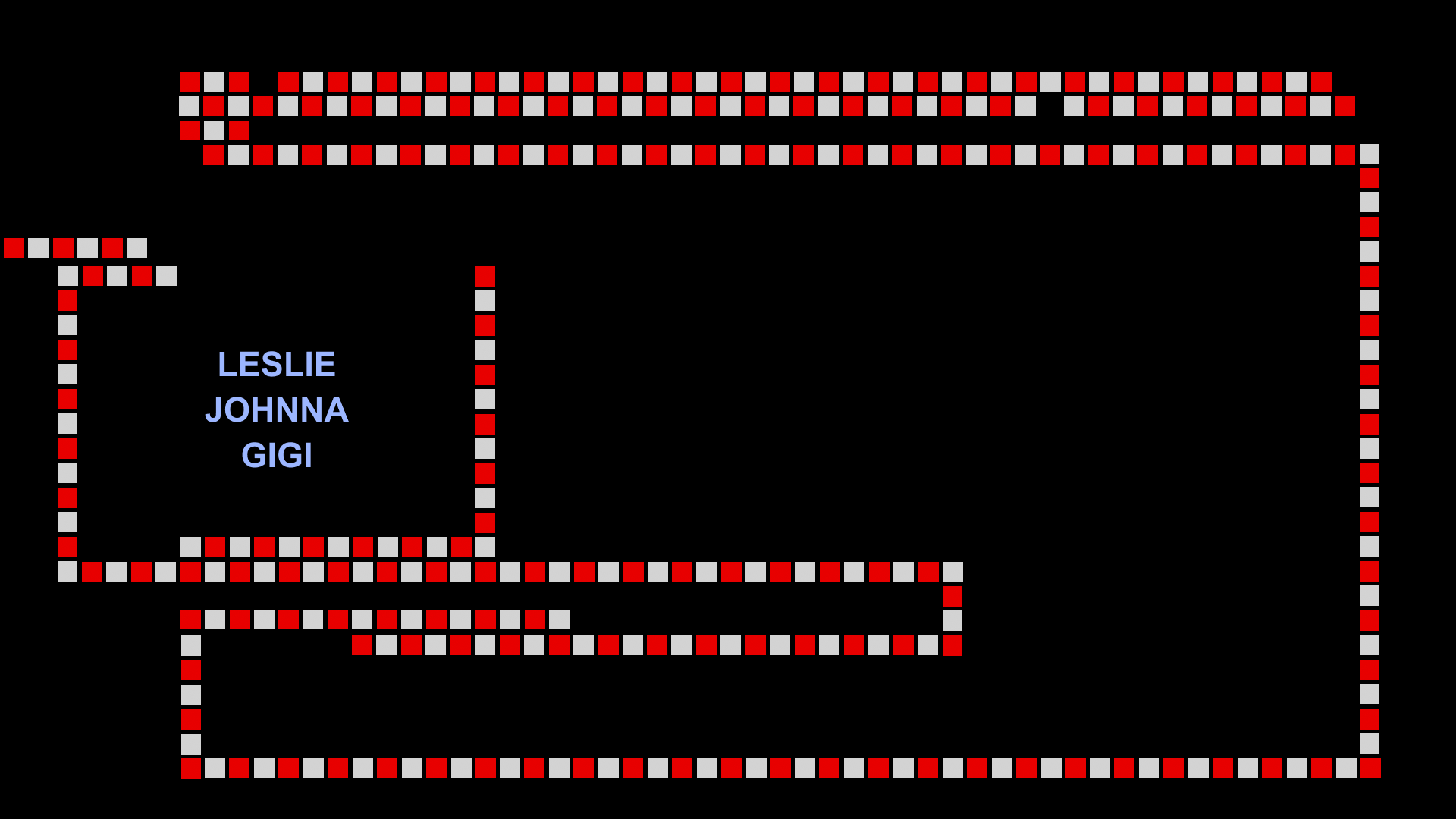
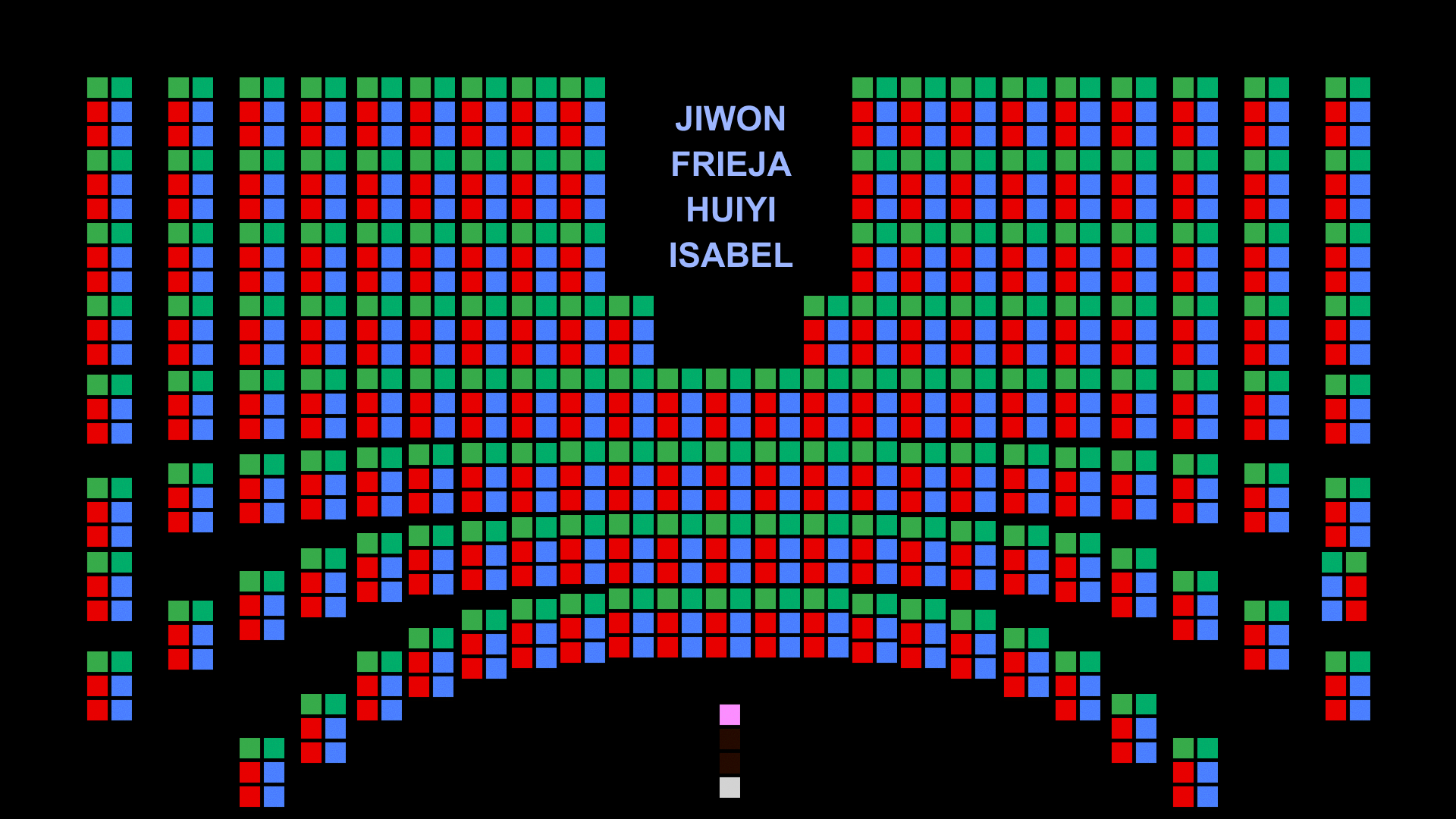
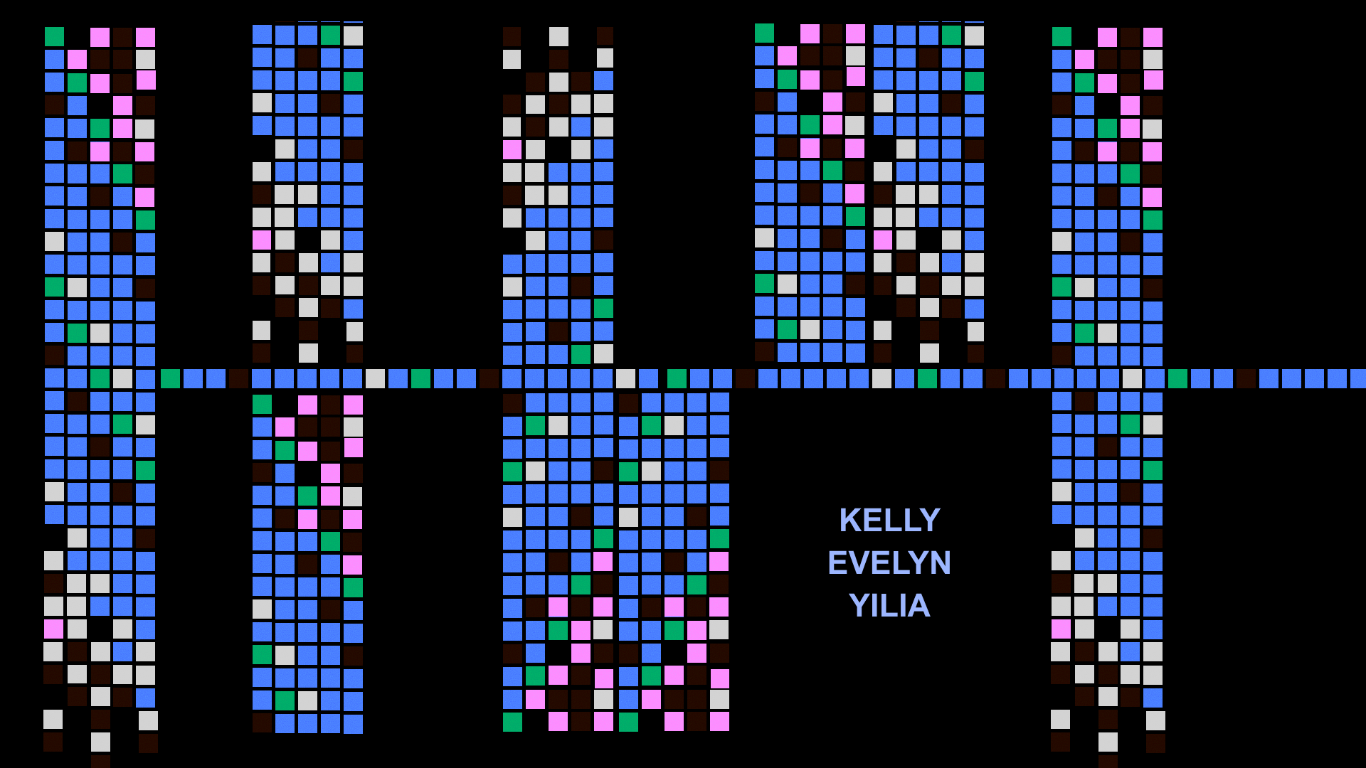
Linked by Air designed some murals for a corporate office. The designs were built around Google's Material Design icons. To help with producing assets, I built this program that renders images in pixels made up of icons.
I think the mural went a different direction but the tool still produces some interesting images. The ones above are tests on various stolen images from the planet/net (Pla-Net)
Tagged as:
With
Linked by Air was asked to produce the exhibition website for Jay-Z's retrospective exhibition at the Brooklyn Public Library. Roc Nation was extremely invested in making this rich exhibition as accessible as possible, and to echo that our website served two functions: in-person digital guide and remote online exhibition. As a result, the website had a unique take on responsive design.
The mobile version serves as an exhibition companion, featuring an audio guide and maps of the library. Visitors were instructed to scan QR codes to tune into Angie Martinez narrate the tour (produced by Aaron Edwards among other talents at Pineapple Street Studios). The interface then breaks the physical exhibition space into small groups. This helped users approach the exhibition, without disrupting the library's daily functioning as a place to read, study, etc.
On desktop, the website acts more as a digital recreation of the exhibition made for users visiting from afar. The audio guide is represented as an editorial experience. The collection of artifacts is displayed more as an archive than a recreation of the exhibition design.
The data model for this site is very cool, and the editing interface is a rich foundation for other exhibition websites we may use in the future. But that's a bit secret for now :-)
This was also one my first sites featuring i18n, which was extremely exciting to implement!

Here’s a photo of me “with” Jay-Z and Beyonce :-)
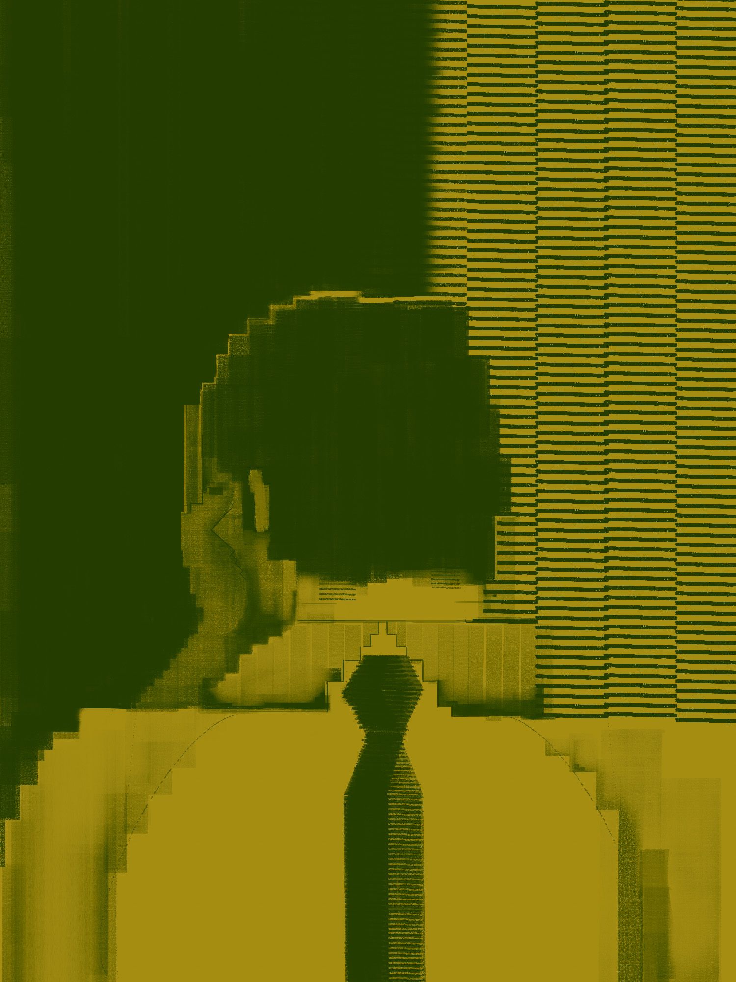
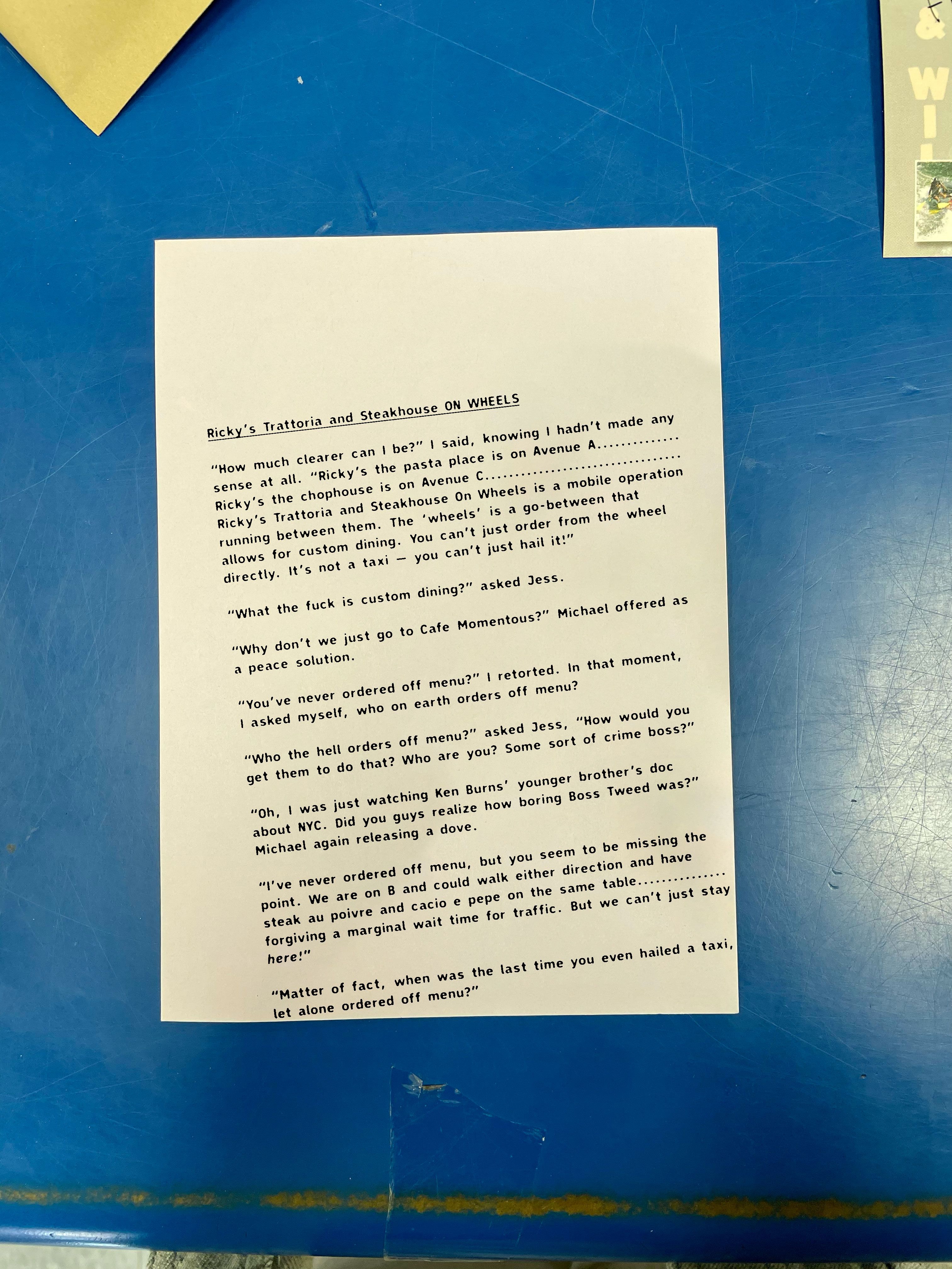
I’m not really sure what this is lol. It’s a short story about ridiculous businesses, and talking in circles with other people. I like how it is falling off the page.
Tagged as:
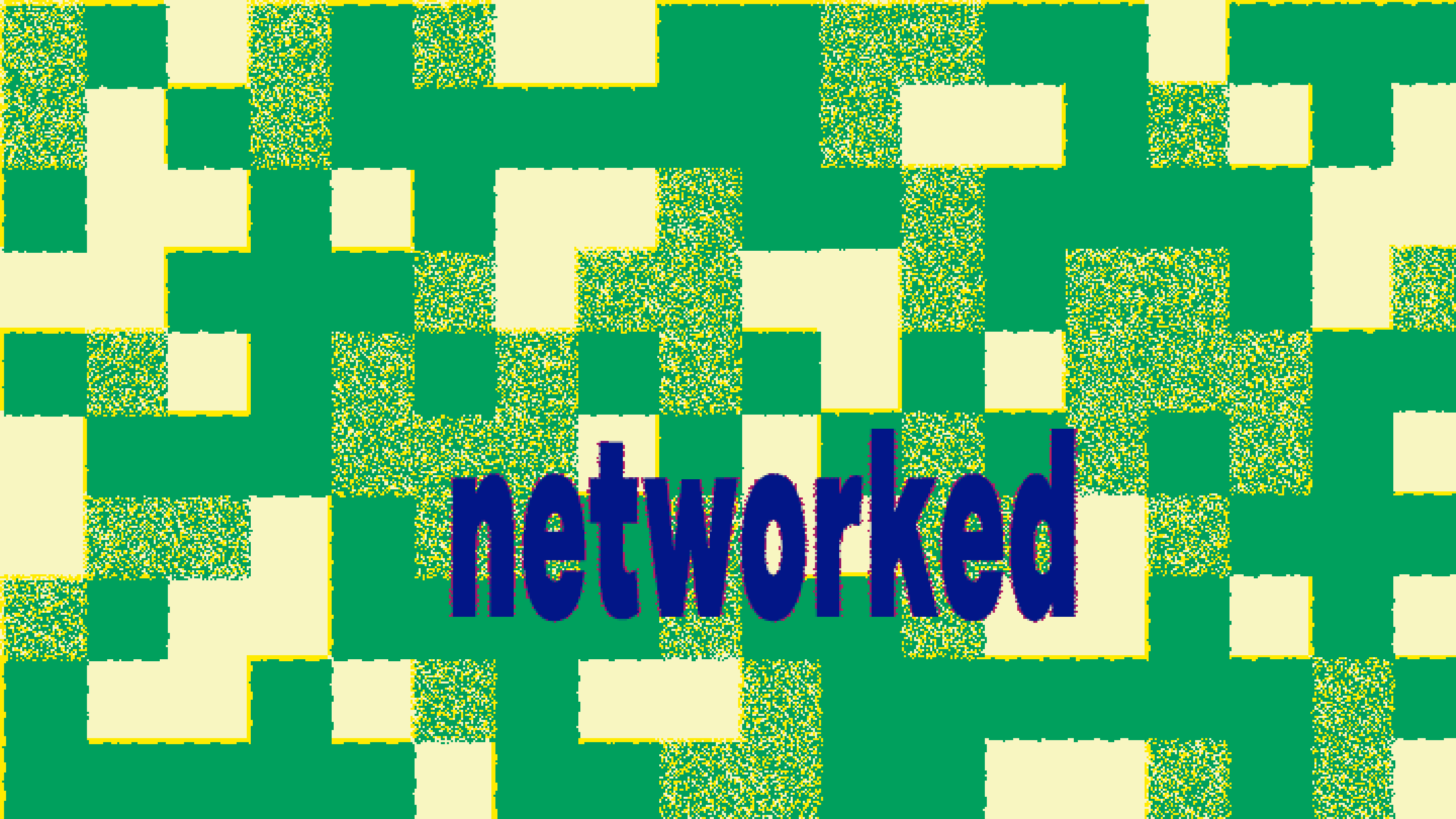
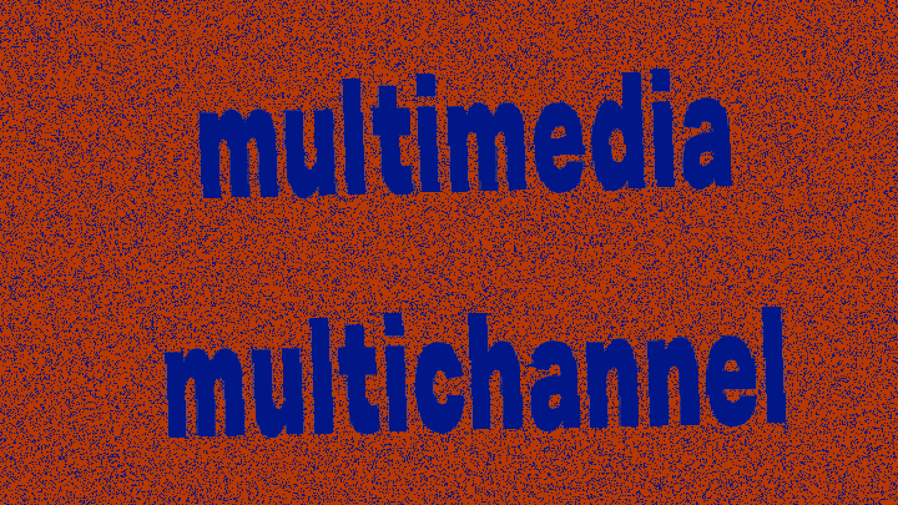
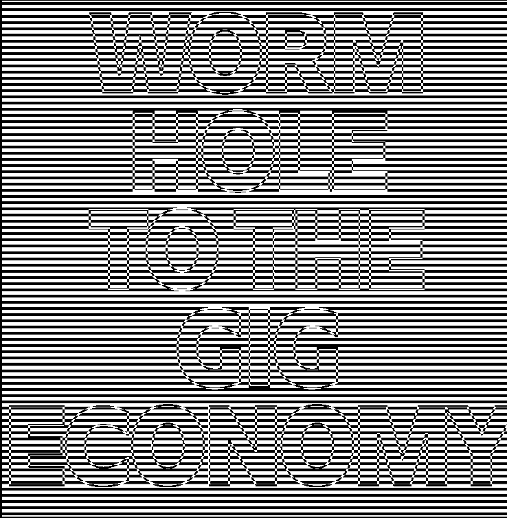
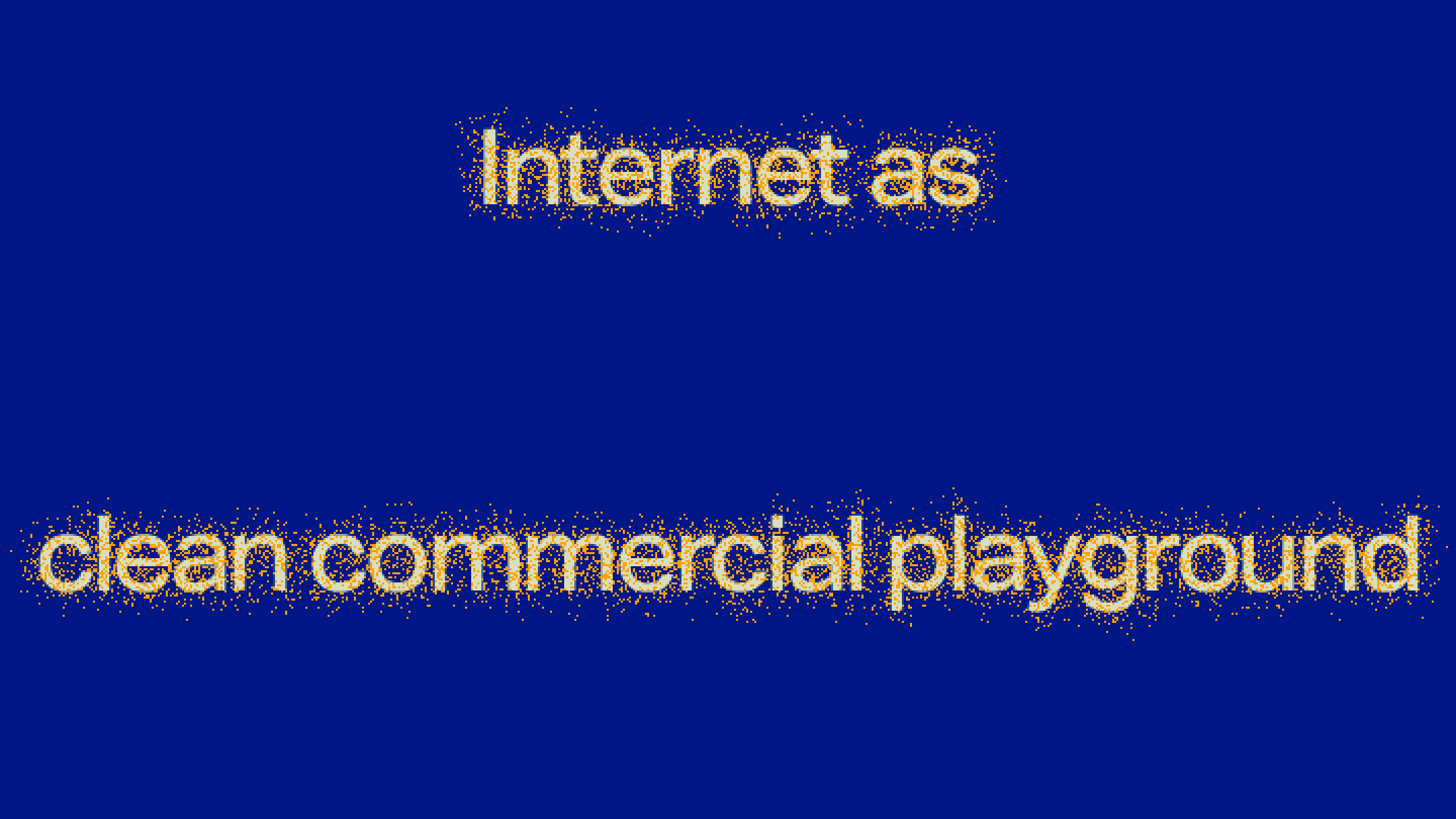
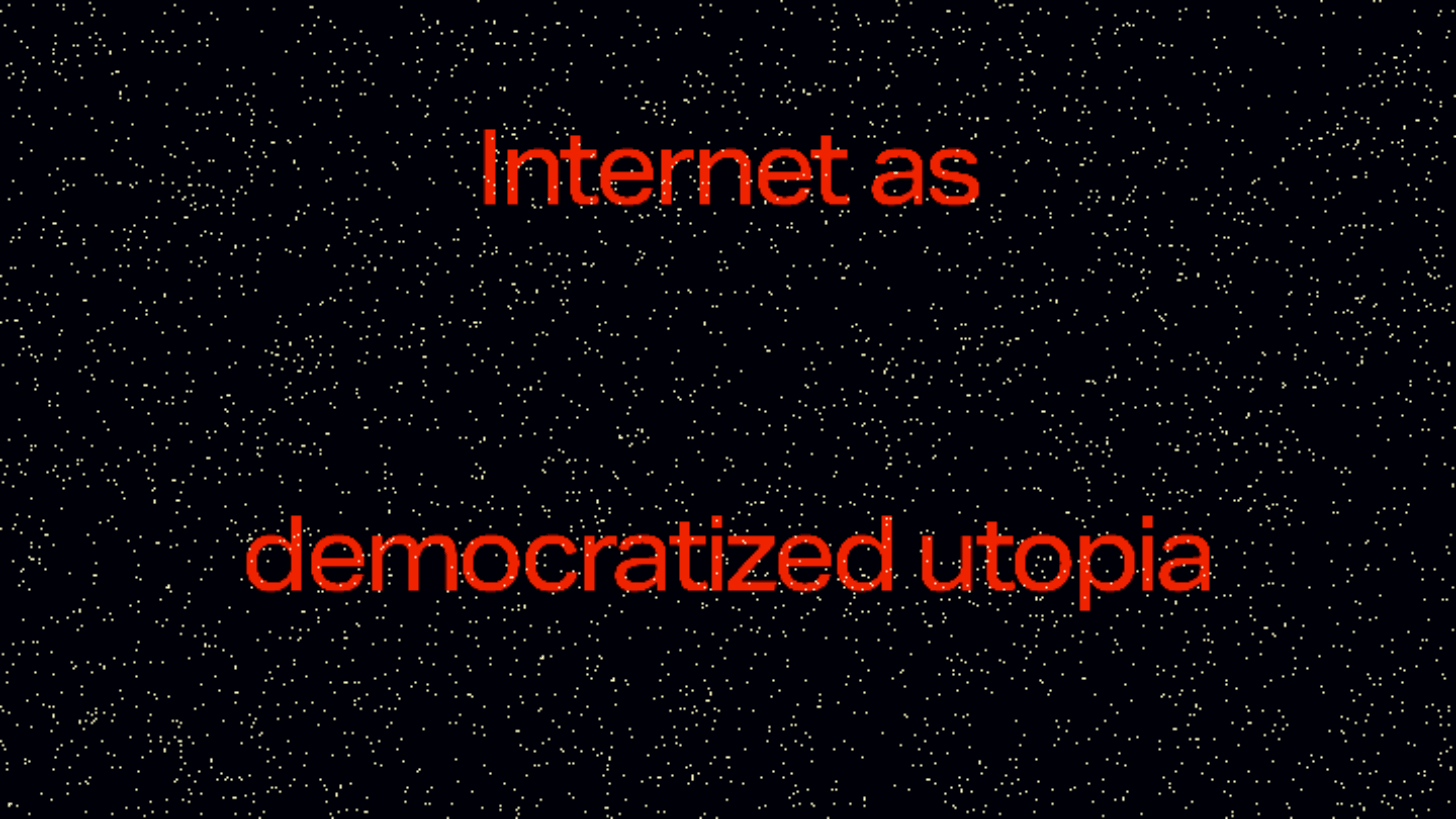
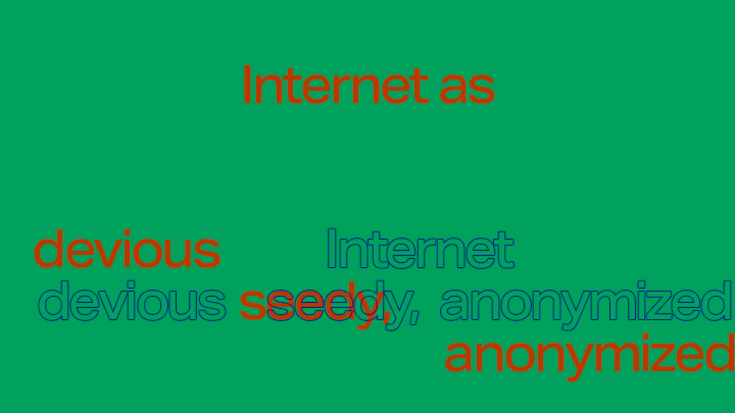
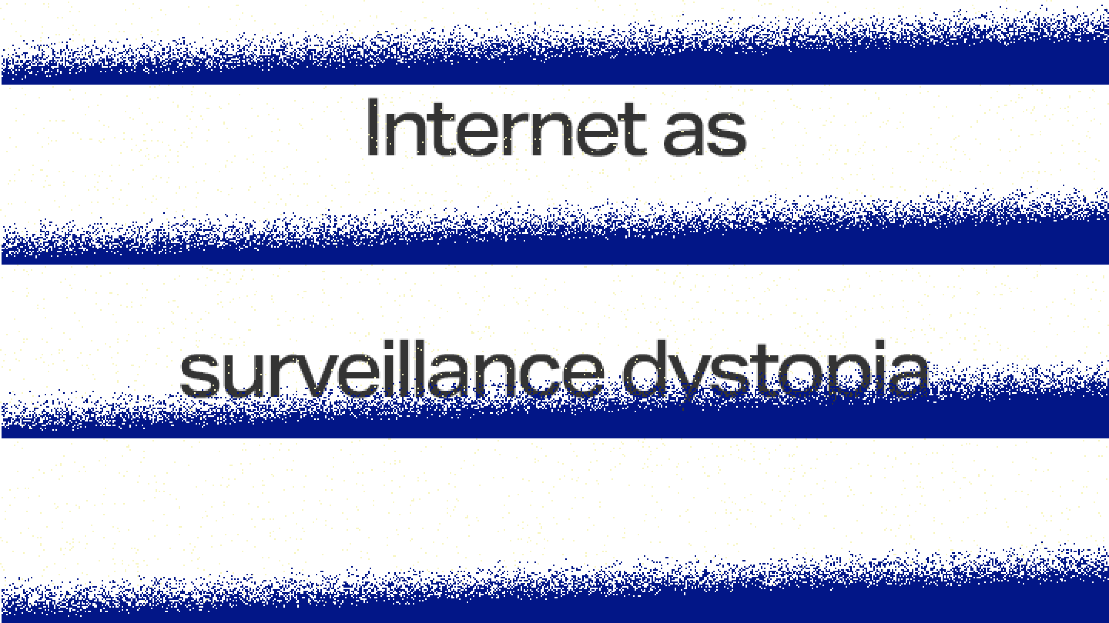
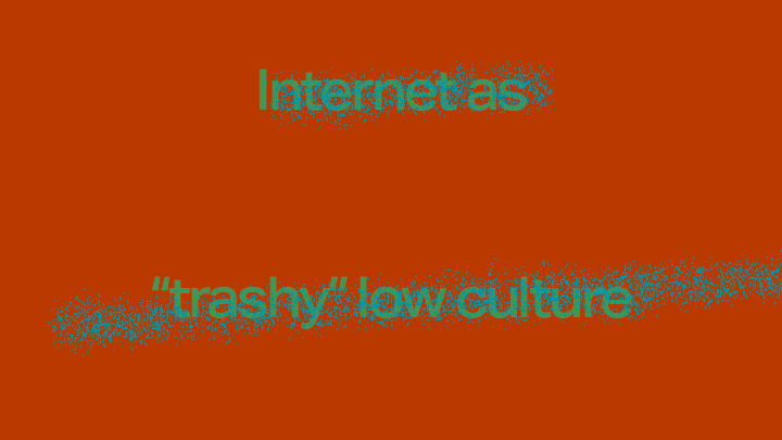
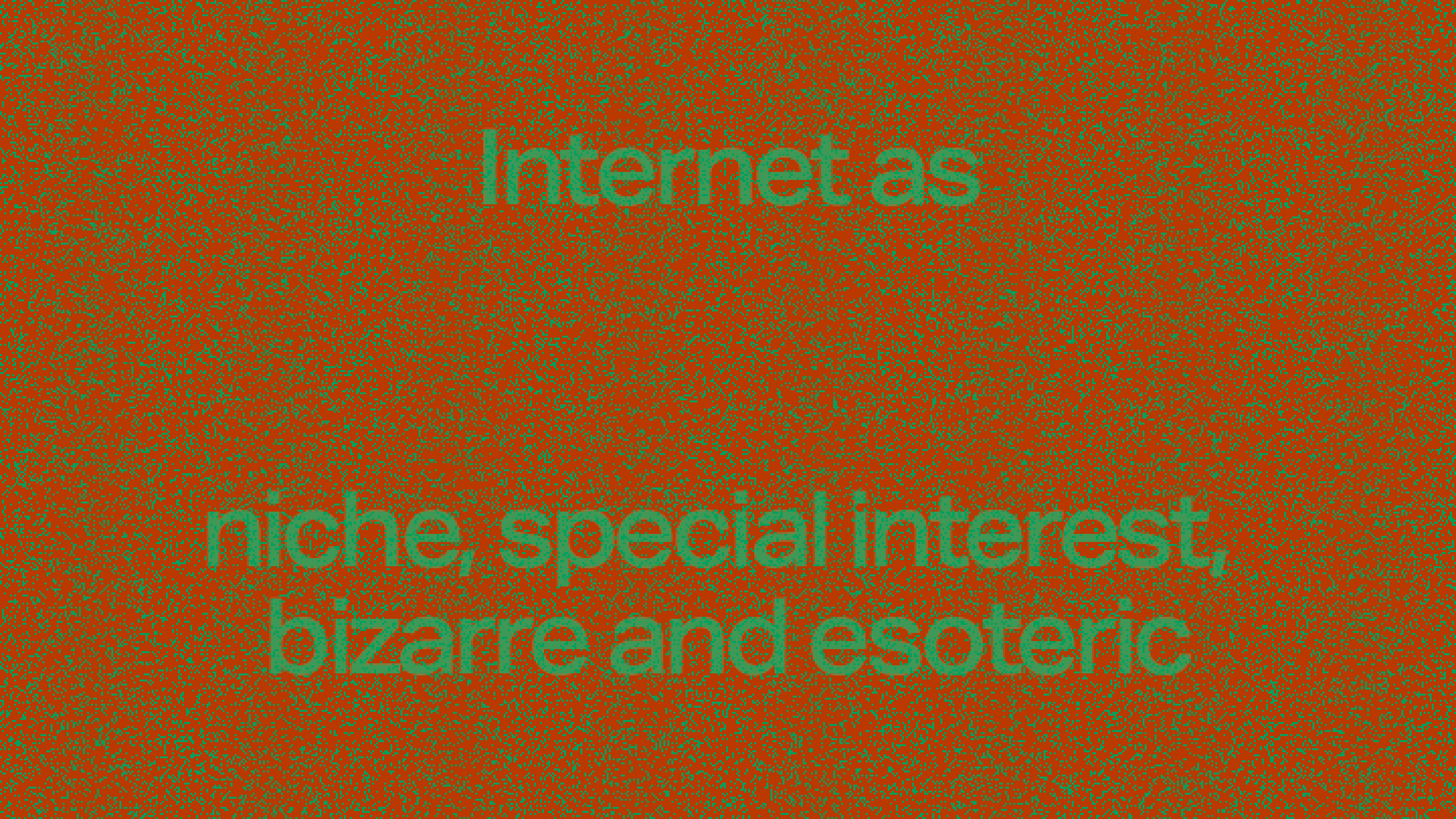
These are slides from a lecture I gave at Mason Gross School of the Arts, about what makes an interesting project on the internet
Tagged as:
Latest
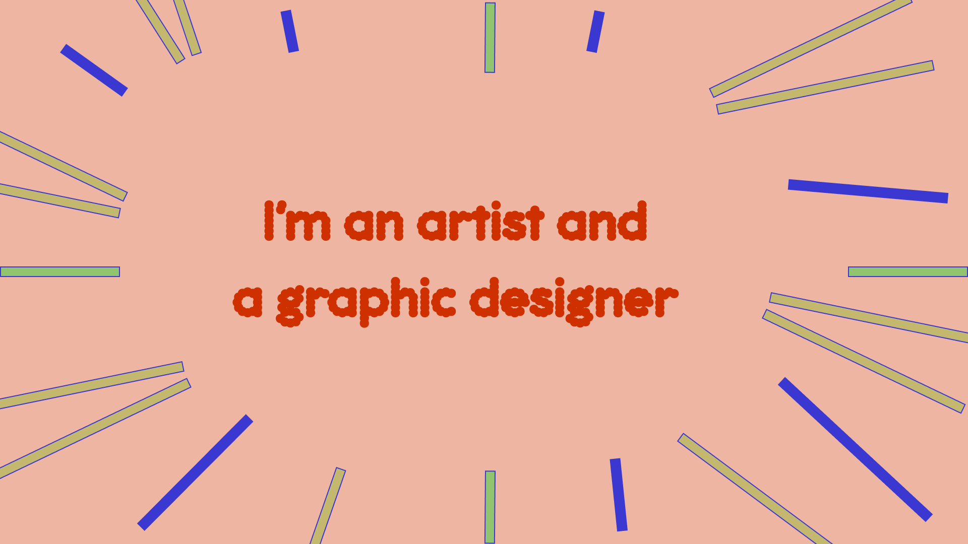
Just some simple slides I used to present my work at the Lubalin Center in spring 2025, talking about how working in education gives me the opportunity to use graphic design as artistic practice, somewhat divorced from its more traditionally commercial uses.

Tagged as:
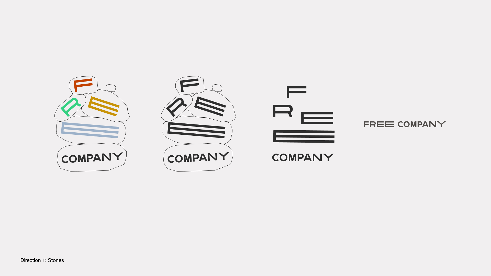
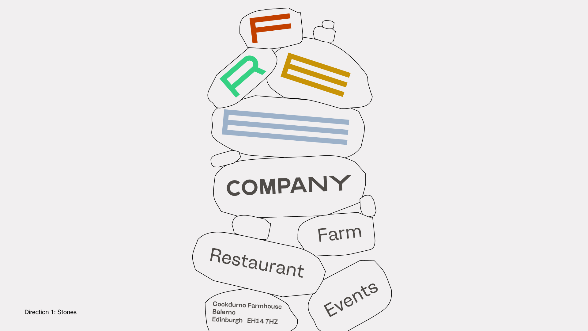
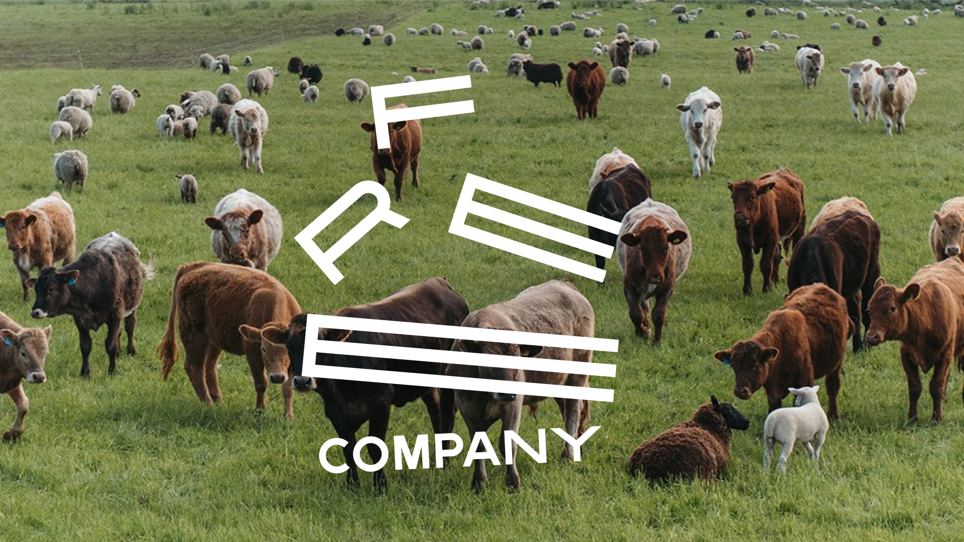
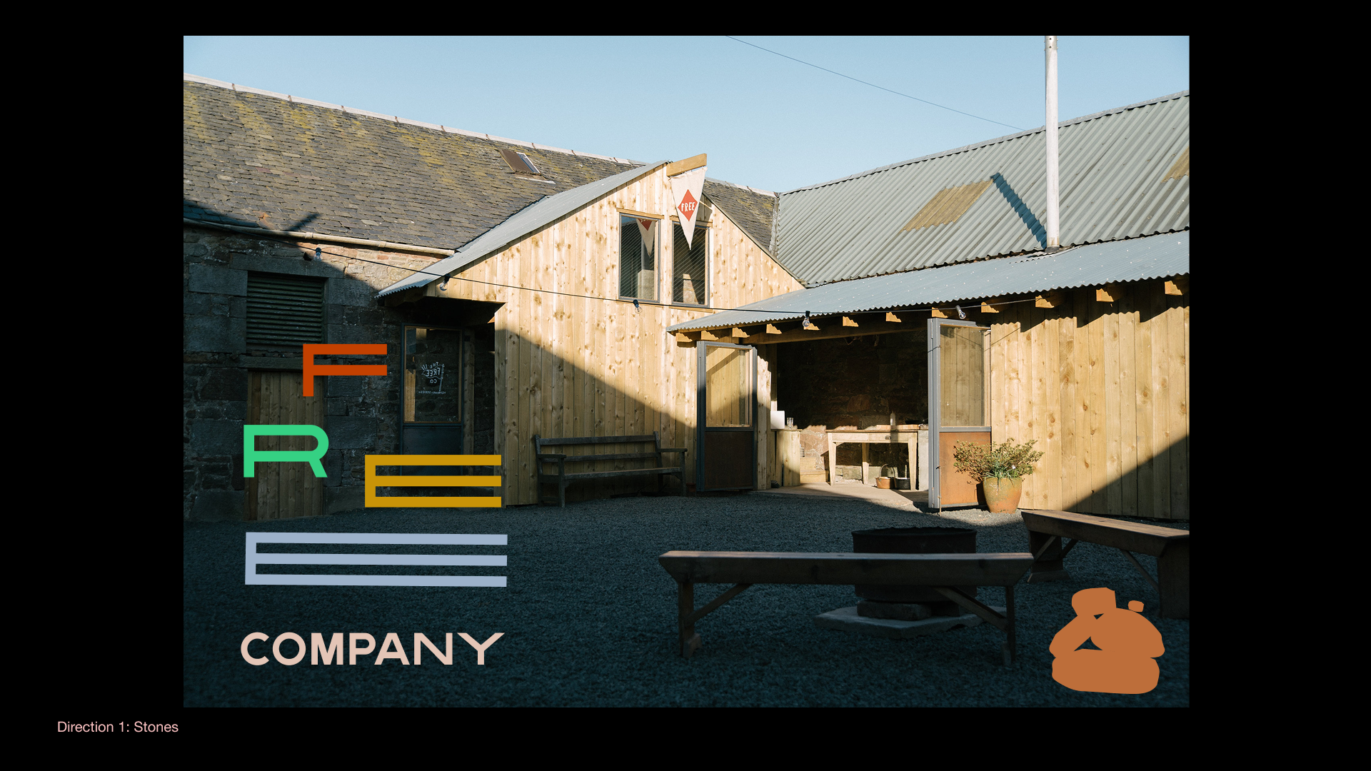
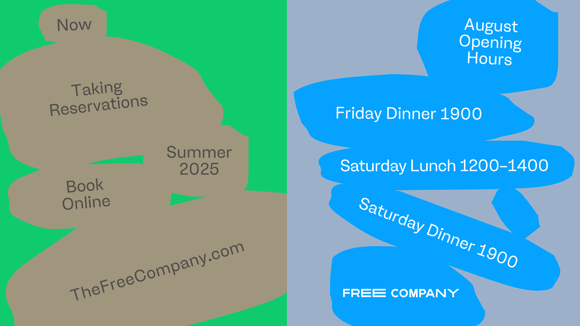
Unfinished identity concept for a regenerative farm and restaurant in Scotland called The Free Company, run by brothers Angus and Charlie Buchanan-Smith. The design is inspired by the farm buildings' stone architecture.
There were some other cute sketches too! These were abandoned earlier in the process, but I think there's some nice ideas in there.


Tagged as:
With