Tagged: web
Linked by Air was asked to produce the exhibition website for Jay-Z's retrospective exhibition at the Brooklyn Public Library. Roc Nation was extremely invested in making this rich exhibition as accessible as possible, and to echo that our website served two functions: in-person digital guide and remote online exhibition. As a result, the website had a unique take on responsive design.
The mobile version serves as an exhibition companion, featuring an audio guide and maps of the library. Visitors were instructed to scan QR codes to tune into Angie Martinez narrate the tour (produced by Aaron Edwards among other talents at Pineapple Street Studios). The interface then breaks the physical exhibition space into small groups. This helped users approach the exhibition, without disrupting the library's daily functioning as a place to read, study, etc.
On desktop, the website acts more as a digital recreation of the exhibition made for users visiting from afar. The audio guide is represented as an editorial experience. The collection of artifacts is displayed more as an archive than a recreation of the exhibition design.
The data model for this site is very cool, and the editing interface is a rich foundation for other exhibition websites we may use in the future. But that's a bit secret for now :-)
This was also one my first sites featuring i18n, which was extremely exciting to implement!

Here’s a photo of me “with” Jay-Z and Beyonce :-)
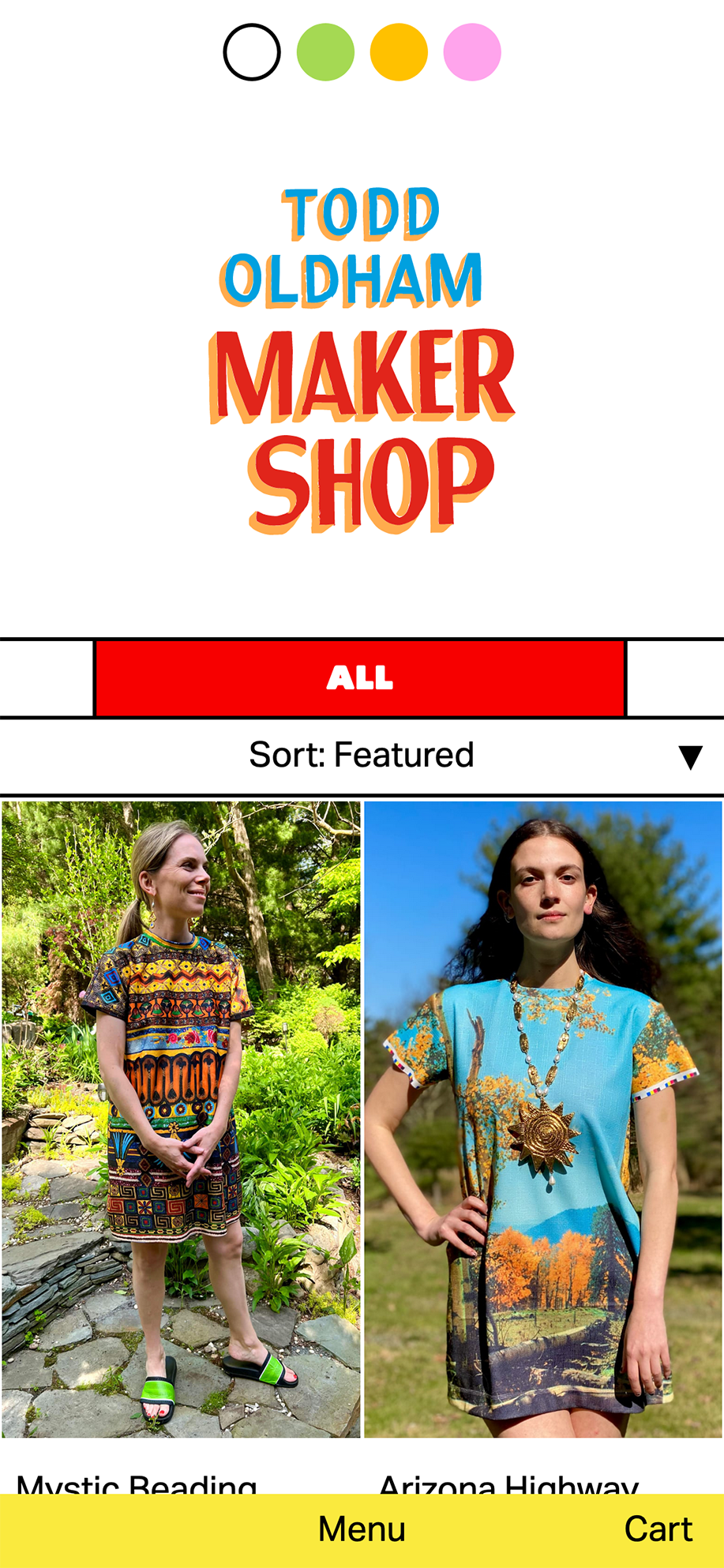
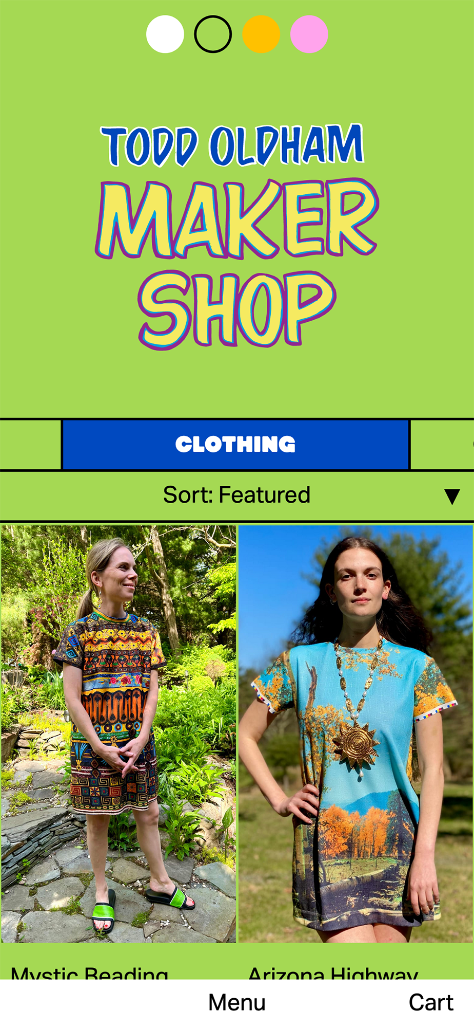
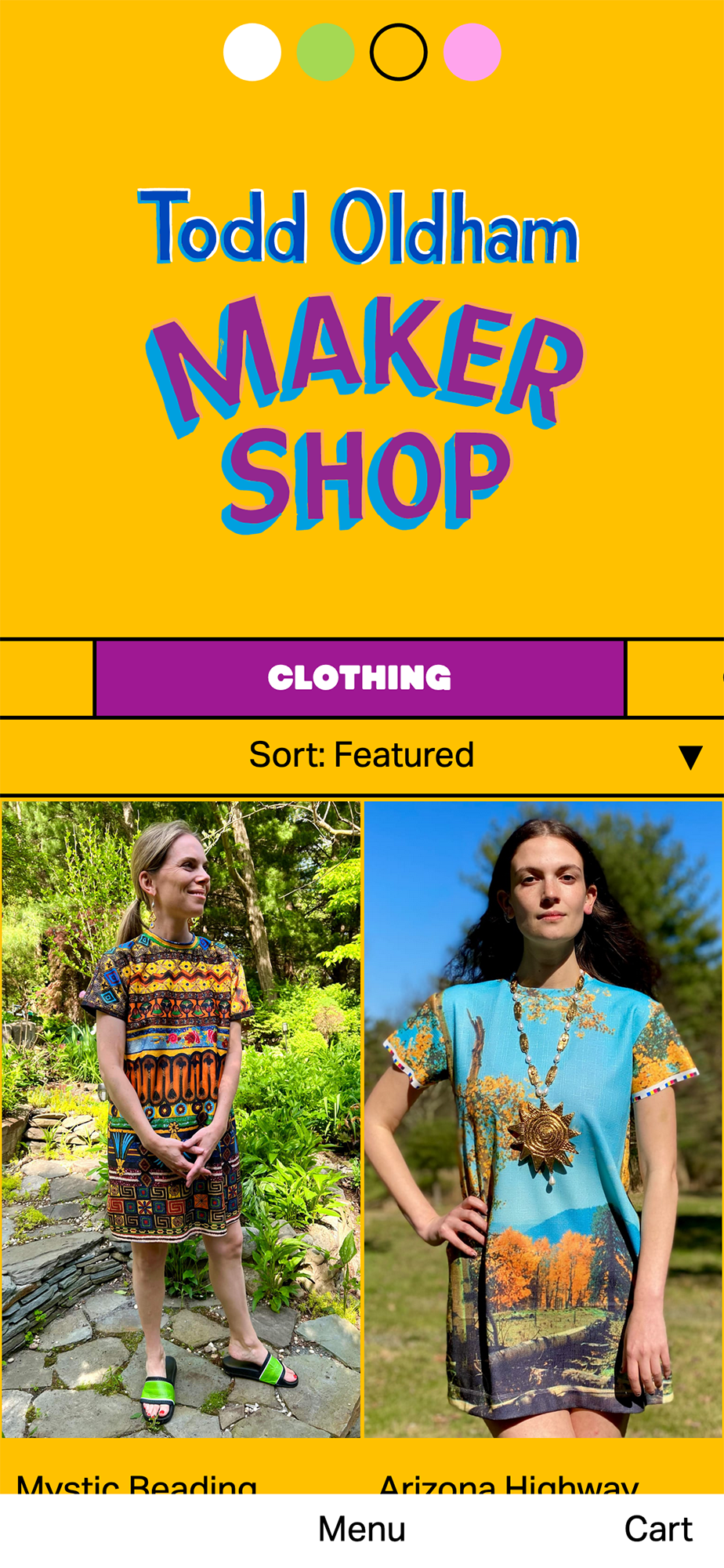
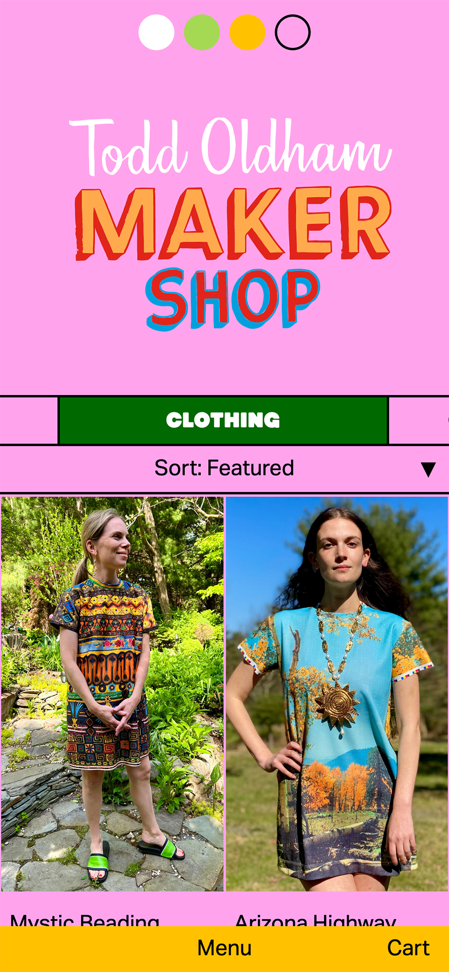
Jess Kuronen and I built a site for Todd Oldham’s return to fashion. The site features Todd’s signature whimsy and love for color. There’s also a ton of weird videos for practically every product, which to us feels novel for an e-commerce website.
Jess and I are happy with the site’s color scheme picker, like it’s 2005. We think about it like the poetics of getting dressed up.
Tagged as:
With
When the Mueller Report was released to the public, Joel Eastwood, Dylan Moriarty, and I pumped out this one-day project looking the categorization of redactions. Of it all, I’m most proud of this solitaire-type animation, which is totally responsive!
Tagged as:
Open Flame is an amazing queer comedy open mic, and I was super excited to make their website. The thing that makes their event so special is the amount of community building that happens in the audience. I’m happy with the finished product, but there was nice sketches along the way. Might make them into my own personal projects soon!
From top:
- Finished website (archived)
- Windows
- Stretch
- Dayglow
Tagged as:
For Valentine’s Day, I wrote about how in love I was. It’s a text format I’m fiddling with: text that’s on display but reticent to let you in.
It’s been a decade since the 2008 Financial Crisis, but risk hasn’t disappeared — it has simply migrated elsewhere. I loved this collaboration with the amazing Jessica Kuronen and Gabriel Gianordoli to tell this expansive story in bite-sized factoids.
Tagged as: